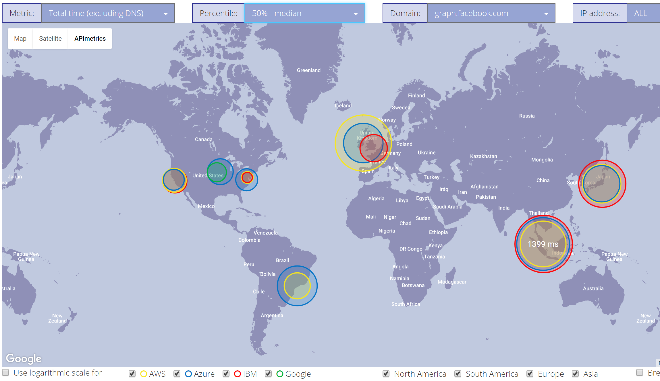
We’ve been trying to work out the best way of visualizing latency data by location and we’re pleased to announce our first version. We’re taking the data for each of the steps of an API call we log; DNS look up, connect time, handshake, processing time etc… and map it to circles of varying sized on a map.
The map shows where the data center is and the color of the circle indicates the source – blue for Azure, yellow for AWS, red for IBM and green for Google. The large the circle the longer the measured latency. It’s already enabled us to find some interesting (and by interesting we always mean weird) behavior in some clouds that wasn’t apparent in the more conventional graphs.
Separately we are providing some data publicly for our network of reference HTTP bin servers on Google Cloud which will give you some live data to ‘play with’ ahead of creating your own. You can see that here.
